
Using custom radio and checkbox controls within the Webix Grid
You can add any HTML into DataGrid cells. There are several ready-to-use solutions for checkboxes, radio buttons, and icons.
These controls and any other HTML elements are set with the template attribute of the columns parameter.
webix.grid({ ... columns:[ { id:"ch1", header:"", template:"{common.checkbox()}" }, { id:"ra1", header:"", template:"{common.radio()}" } ]});Сheckbox
Section titled “Сheckbox”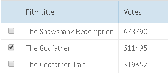
To fill a column with checkboxes, set the template attribute to “{common.checkbox()}”:
// Creating a checkbox columnwebix.grid({ columns:[ { id:"ch1", header:"", template:"{common.checkbox()}"} ... ]})you can check the full snippet Checkbox and Radio in a DataGrid
Radio buttons
Section titled “Radio buttons”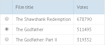
To fill a column with radio buttons, set the template attribute to “{common.radio()}”:
// Creating a radio columncolumns:[ { id:"r1", header:"", template:"{common.radio()}"}]you can check the full snippet Using “Inline” Editors
Catching Changes of Checkbox and Radio States
Section titled “Catching Changes of Checkbox and Radio States”You can catch the change in the state of a checkbox or a radio button with the help of the onCheck event.
webix.grid({ columns:[ { id:"ch1", header:"", checkValue:'on', uncheckValue:'off', template:"{common.checkbox()}"}, { id:"ra1", header:"", checkValue:'on', uncheckValue:'off', template:"{common.radio()}"}, // other columns ], data: grid_data, on:{ onCheck:function(rowId, colId, state){ console.log(state); } }});Custom Checkbox
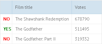
Section titled “Custom Checkbox”You can create a custom checkbox following these steps:
- Define the template attribute as a function that creates and returns a checkbox.
- Set the checkboxRefresh:true to make the grid refresh after each change of the checkbox value.
1. Define a function that creates and returns a checkbox
The function must return two strings with HTML:
- for the checked checkbox
- for the unchecked checkbox
The function will receive 3 parameters and will be called for each data item:
- obj - (object) the data item object
- common - (object) the predefined checkbox template
- value - (boolean) the value of the checkbox. true if the box is checked, otherwise false. Initially, the parameter is null, and it becomes boolean only after the user clicks the checkbox.
Important!: the ‘webix_table_checkbox’ CSS class.
The ‘webix_table_checkbox’ class makes an arbitrary HTML element behave as a checkbox. So don’t forget to add ‘webix_table_checkbox’ to the class attribute among other classes.
// Function that defines a custom checkboxwebix.grid({ columns:[ { id: "ch1", header: "", template: custom_checkbox }, // ... ]});custom, checked, and unchecked are custom CSS classes, e.g.:
No changes made.2. Specify the 'checkboxRefresh' parameter and set it to *true*.
With the checkboxRefresh parameter, each time the checkbox value is changed, the grid repaints the related data record.
// Refresh grid rows after each click on a checkboxwebix.grid({ ... columns:[ { id:"ch1", header:"", template:custom_checkbox }, ... ], checkboxRefresh:true});you can check the full snippet Custom Checkbox and Radio in DataGrid
Custom Radio
Section titled “Custom Radio”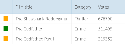
To create a custom radio, define the template attribute as a function that creates a radio button.
The function must return two strings with HTML:
- for the checked radio button
- for the unchecked radio button
The function will take 3 parameters and be called for each data item:
- obj - (object) the data item object
- common - (object) the predefined radio template
- value - (boolean) the value of the radio. true, if the radio is checked. Otherwise, false. Initially, the parameter is null and takes the boolean value just when you check the radio.
Important!: the ‘webix_table_radio’ CSS class.
The ‘webix_table_radio’ class makes an arbitrary HTML element behave as a radio. So don’t forget to add ‘webix_table_radio’ to the class attribute among other classes.
// Function defining a custom radiowebix.grid({ columns:[ { id: "ch1", header: "", template: custom_radio }, // ... ]});custom, checked, and unchecked are custom CSS classes, e.g.:
No changes made.you can check the full snippet Custom Checkbox and Radio in DataGrid