DataGrid Header Menu

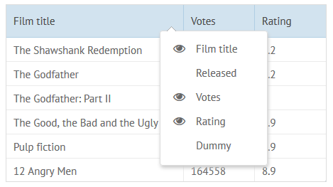
DataGrid built-in header menu is used to control column visibility. The header menu is a popup list with column names that is opened when you right-click a header.
Simple Configuration
Section titled “Simple Configuration”To add a simple header menu, set headermenu:true in the DataGrid config. A simple header menu has the following features:
- the menu is opened by a right click on the header of any column;
- the menu lists the names of all columns;
- there are icons (“eye”) next to the names of visible columns;
- the height of the menu is adjusted to the number of menu items;
- the width of the menu is 150px.
webix.grid({ columns:[/* columns configuration */], headermenu:true})you can check the full snippet Header Menu in the DataGrid
Extended Configuration
Section titled “Extended Configuration”HeaderMenu can be defined as an object with configuration options for the menu list and may include:
- width (number) - the width of the popup in pixels;
- height (number) - the height of the popup in pixels;
- autoheight (boolean) - if true, adjusts the popup height to the number of menu items. true by default;
- autowidth (boolean) - if true, adjusts the popup width to the width of column names. false by default;
- yCount (number) - the height of the menu measured in items;
- scroll (boolean) - if true, enables a scrollbar. false by default;
- spans (boolean) - to hide (false) / show (true) columns with related spans;
- data (array) - the columns that must be shown in the menu (if not set, all columns are displayed in the menu). Each item contains:
- id - the column ID (the same one as in the columns configuration);
- value - the title of a datagrid column (its header, as a rule).
- template (string, function) - the template of menu items (if you need to show a property other than value in the list).
Use Cases
Section titled “Use Cases”Scrollable header menu with extra width
webix.grid({ columns:[/* columns configuration */], headermenu:{ width:250, autoheight:false, scroll:true }})you can check the full snippet DataGrid: Extended Header Menu
Header menu with some specific columns
webix.grid({ columns:[/* columns configuration */], headermenu:{ data:[ { id:"year", value:"Released"}, { id:"rating", value:"Rating"} ] }})you can check the full snippet DataGrid: Extended Header Menu
Excluding a column from the menu
To exclude any column from the header menu, add headermenu:false to its config:
webix.grid({ headermenu:true, // enables the header menu columns:[ // excluding "id" column from the menu {id:"id", header:"#", headermenu:false}, {id:"title", header:"Title"} ]})Attaching HeaderMenu to Other Elements
Section titled “Attaching HeaderMenu to Other Elements”Extra “headermenu” column
Section titled “Extra “headermenu” column”Header menu can also be shown by a left mouse click over a specific datagrid column. Add content:“headerMenu” to the config:
webix.grid({ columns:[ { header:{ content:"headerMenu" }, headermenu:false, width:35 } ]})you can check the full snippet Header Menu Icon in the DataGrid
If there is such a column in the datagrid configuration, the headermenu property for it can be omitted.
The content property of a header line is also used to set built-in filters and define column groups.
Showing header menu on demand
Section titled “Showing header menu on demand”The headermenu unique ID can be accessed through the datagrid config object. If you know this ID, you can work with the headermenu like with any other popup window, e.g. show it when needed.
const grid = webix.grid({  id:"dt2",  columns:[/* columns configuration */],  headermenu:true});
//show the headermenu by APIfunction showMenu(){  var menu = grid.config.headermenu;  menu.show();}
you can check the full snippet Header Menu Icon in the DataGrid
