
Pager Controls
DataGrid supports paging over the items in the data source. You enable and configure paging through the pager parameter.
Paging doesn’t depend on the way you load data into DataGrid: static or dynamic, an external data file or a database table. In the most common case of data being dynamically loaded from a URL, Webix DataGrid will make requests to that URL with extra query parameters specifying which records to load.
DataGrid can display direction controls (that provide forward and backward navigation) as well as numeric controls that allow the user to move to a specific page. Generally, you should just specify the pager parameter with the required attributes.
// Basic pager configurationwebix.grid({ pager:{ size:100, // the number of records per page group:5 // the number of buttons in the pager }})you can check the full snippet Static Paging. Loading from an External Data File
Pager Controls
Section titled “Pager Controls”If you set the pager parameter, DataGrid automatically adds controls for page navigation. You can customize those controls by specifying a certain template for them.
The template is set by the template attribute of the pager parameter and can contain the following values:
- {common.first()} - the button to move to the first page
- {common.prev()} - the button to move to the previous page
- {common.next()} - the button to move to the next page
- {common.last()} - the button to move to the last page
- {common.pages()} - number buttons to move to a specific page.
Depending on what you want to display on the paging area, add the related items to your template.
// Using templates in pagerwebix.grid({ pager:{ template:"{common.prev()} {common.pages()} {common.next()}", size:10, group:5 }});you can check the full snippet Using Templates for Pagers
Generally, using the mentioned values, you can set the following combinations for DataGrid:
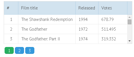
- Numeric (default)
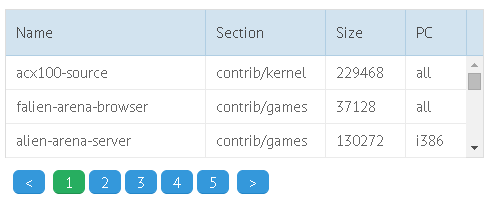
- Next/Previous
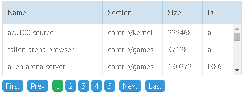
- Next/Previous/First/Last
- Numeric/First/Last
- Numeric/Next/Previous/First/Last
The first combination is set by default. Others can be achieved with the help of templates (see the table below).
| Mode | Image | Related template |
|---|---|---|
| Numeric |  |
default mode, doesn't require specifying a separate template |
| Next/Previous |  |
template:" {common.prev()} {common.next()} " |
| First/Previous/Next/Last |  |
template:" {common.first()} {common.prev()} {common.next()} {common.last()}" |
| Numeric/First/Last |  |
template:" {common.prev()} {common.pages()} {common.next()}" |
| Numeric/Next/Previous/First/Last |  |
template:" {common.first()} {common.prev()} {common.pages()} {common.next()} {common.last()}" |
Customizing Pager Labels
Section titled “Customizing Pager Labels”You can set some text instead of arrows for the Next, Previous, First and Last buttons.
// Specifying custom labels for pager controlswebix.grid({ pager:{ template:`{common.first()} {common.prev()} {common.pages()} {common.next()} {common.last()}`, size:10, group:5 }})It’s not obligatory to redefine all the mentioned buttons at once, you can redefine just a part of them. In this case, webix.locale.pager will contain just the required buttons.
you can check the full snippet Pager Localization
The Size of a Page
Section titled “The Size of a Page”The size of a page is a number of items to display at once on a page. This number is set by the size attribute:
// Setting the number of records on a pagepager:{ size:100, // the number of records on a page ...}Multiple Pagers on a Page
Section titled “Multiple Pagers on a Page”Several pagers can be on one and the same page.
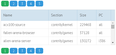
To add an additional pager to a page you should call method clone() and
set there configuration of your new pager using the same attributes you use while defining the pager parameter:
// Specifying 2 pagers on a pagewebix.grid({    pager:{..}});
grid.getPager().clone({    size:10,    group:5});
you can check the full snippet Defining Several Pagers on a Page