
Sparklines Types
Sparklines are small graphs embedded into the datagrid and used for presenting the general variation of certain parameters. Each data value is specified as a point in the sparkline. Depending on the value, points are located at a different height relative to each other.
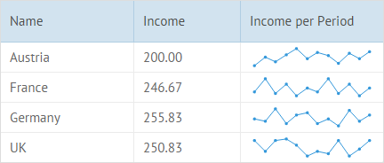
Sparklines are set in the datagrid through the {common.sparklines()} template. The column’s id coincides with the property in the data set that contains data values. The Sparklines chart is built on the basis of these values:
webix.grid({ columns:[ { id:"name", header:"Name", width:150}, { id:"avIncome", header:"Income", width:120}, // sparklines { id:"income", header:"Income per Period", template:"{common.sparklines()}", width:160 } ], autoheight:true, autowidth:true, data: [ { id:1, name:"Austria", income:[150,200,170,210,250,190], avIncome: 200}, { id:2, name:"France", income:[230,300,220,270,210,250], avIncome: 246.67}, { id:3, name:"Germany", income:[250,240,300,230,270,280], avIncome: 255.83}, { id:4, name:"UK", income:[280,230,280,290,260,210], avIncome: 250.83} ]});you can check the full snippet Line
Sparklines Types
Section titled “Sparklines Types”There are six types of Sparklines representation available:
To create a template function for a sparkline with the type different from the default one, use the webix.Sparklines.getTemplate(“type_name”) method.
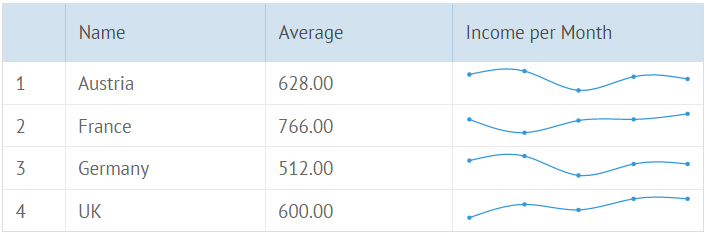
Line Sparklines
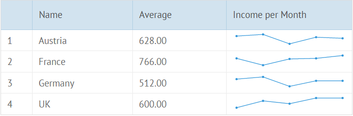
{ id:"income", header:"Income per Month", template: "{common.sparklines()}", width:200}you can check the full snippet Line
Area Sparklines
{ id:"income", header:"Income per Month", template: webix.Sparklines.getTemplate("area"), width:200}you can check the full snippet Area
Bar Sparklines
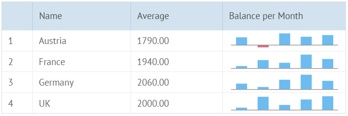
{ id:"balance", header:"Balance per Month", template: webix.Sparklines.getTemplate("bar"), width:200}you can check the full snippet Bar
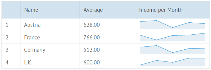
Spline Sparklines
{ id:"income", header:"Income per Month", template: webix.Sparklines.getTemplate("spline"), width:200}you can check the full snippet Spline
SplineArea Sparklines
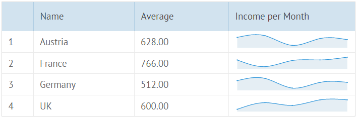
{ id:"income", header:"Income per Month", template: webix.Sparklines.getTemplate("splineArea"), width:200}you can check the full snippet SplineArea
Pie Sparklines
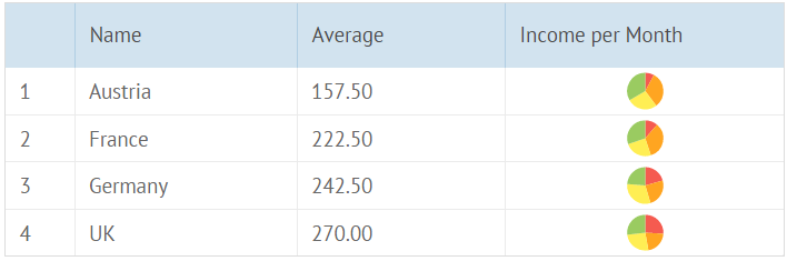
{ id:"income", header:"Income per Month", template: webix.Sparklines.getTemplate("pie"), width:200}you can check the full snippet Pie
Radar Sparklines
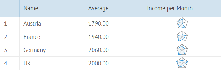
{ id:"income", header:"Income per Month", template: webix.Sparklines.getTemplate("radar"), width:200}you can check the full snippet Radar
Sparklines Tooltips
Section titled “Sparklines Tooltips”You can specify tooltips for sparklines values in a datagrid. They will appear when the user will move the mouse pointer over the sparklines items (bars, sectors).
Sparklines tooltip is set via the “tooltip” template. The template function takes a data item of Sparkline as the first parameter.
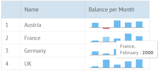
webix.grid({ columns:[ { id:"values", header:"Values", template: "{common.sparklines()}", tooltip: function(obj, common, value, index){ if (!value) return ""; return obj.name+",<br/>"+value.month+" : <b>"+value.value+"</b>"; } }, ... ], tooltip: true, ... data: [ {id: 1, name: "Austria", values: [ {value: 2000, month: "January"}, {value: 1000, month: "February"}, {value: 3000, month: "March"} ]}, ... ]});you can check the full snippet Tooltips Definition
Customizing Sparklines
Section titled “Customizing Sparklines”You can customize sparklines by providing custom options in their configuration:
webix.Sparklines.getTemplate({ type:"bar", // sparkline type paddingY:0, // other settings origin:300});you can check the full snippet Sparkline Settings
For a Bar type, you can set horizontal bars (barH):
webix.Sparklines.getTemplate({ type:"bar", horizontal: true});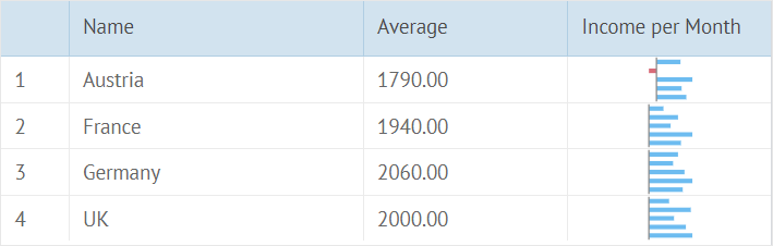
For a Pie type, you can set a donut option to display it with a round empty space inside:
webix.Sparklines.getTemplate({ type:"pie", donut: true});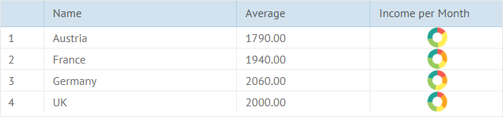
The set of available options depends on the sparkline type:
Line sparkline settings
- paddingX - left and right padding
- paddingY - top and bottom paddings
- radius - the point radius
- eventRadius - the radius of a clickable area around the point
- minHeight - the minimal height
- css - a custom CSS class for the sparkline
- origin - the scale origin
- scale - the maximum scale value
- color - the line color
Bar sparkline settings
- paddingX - the left and right padding
- paddingY- top and bottom paddings
- width - the bar width
- margin - the bar margin
- minHeight - the minimal height
- origin - the scale origin
- itemCss - the bar css
- scale - the maximum scale value
- color - the bar color
- negativeColor - the color of the bars below the X scale
- horizontal - the horizontal bars
Area sparkline settings
- paddingX - the left and right padding
- paddingY - the top and bottom paddings
- radius - the point radius
- eventRadius - the radius of a clickable area around the point
- minHeight - the minimal height
- css - the custom CSS class for the sparkline
- color - the line color
Pie sparkline settings
- paddingY - top and bottom paddings
- css - a custom CSS class for the sparkline
- color - the pie color
- donut - the pie chart with a round empty space inside
- innerRadius - the radius of the round empty space inside a chart
Spline sparkline settings
- paddingX - the left and right padding
- paddingY - top and bottom paddings
- radius - the point radius
- eventRadius - the radius of a clickable area around the point
- minHeight - the minimal height
- css - a custom CSS class for the sparkline
Radar sparkline settings
- padding - left, right, top and bottom paddings
- radius - the point radius
- eventRadius - the radius of a clickable area around the point
- color - the line color
- css - a custom CSS class for the sparkline
Setting Sparklines Colors
Section titled “Setting Sparklines Colors”There are two variants of configuring sparklines colors using the color property:
- to set a custom color for sparklines
{ id:"income", header:"Custom color", template: webix.Sparklines.getTemplate({ type:"area", color: "#5868bf" }), width:200}- to specify different colors of sparklines for datagrid rows
var bar1 = webix.Sparklines.getTemplate({  type:"bar", color: "#5868bf"});var bar2 = webix.Sparklines.getTemplate({  type:"bar", color: "#3ea4f5"});
...
{  id:"income",    header:"Row color",    template: function(obj,type,data,column,index){         var template = (index%2 ? bar1 : bar2);        return template.apply(this, arguments);  },  width:200}
you can check the full snippet Colors
Negative color option for Bar sparklines
You can set a certain color for a negative value while rendering a Bar sparkline. It is set by the negativeColor property:
{ id:"income", header:"Negative color", template: webix.Sparklines.getTemplate({ type:"bar", negativeColor: "#d86c79" }), width:200}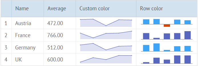
you can check the full snippet Colors