
Styling documentation page: using CSS skins to define the Webix Grid look
Webix DataGrid provides several skins that you can use to change the overall look of your grid:
Each skin requires including its specific CSS file.
Using Skins
Section titled “Using Skins”In order to apply the selected skin correctly, you should take two steps:
1. Include the .css file of the necessary skin into the document’s head:
<link href="../codebase/skins/flat.css" rel="stylesheet" type="text/css">2. Choose either of the two ways given below:
- the simplest and recommended way is to initialize the app within the webix.ready() function:
webix.ready(function(){ webix.ui({..});});- or you can also define a global webix_skin variable before including webix.js into the app:
<script>webix_skin = "flat";</script><script src="../codebase/webix.js" type="text/javascript" charset="utf-8"></script>Material
Section titled “Material”To apply the Material skin, include the default CSS file:
// Applying the "Material" skin to the app<script src="../codebase/webix.js"></script><link href="../codebase/skins/webix.css" rel="stylesheet" type="text/css">
To apply the Mini skin, include the mini.css file:
// Applying the "Mini" skin to the app<script src="../codebase/webix.js"></script><link href="../codebase/skins/mini.css" rel="stylesheet" type="text/css">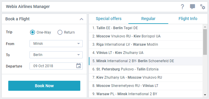
To apply the Flat skin, include the flat.css CSS file:
// Applying the 'Flat' skin to the app<script src="../codebase/webix.js"></script><link href="../codebase/skins/flat.css" rel="stylesheet" type="text/css">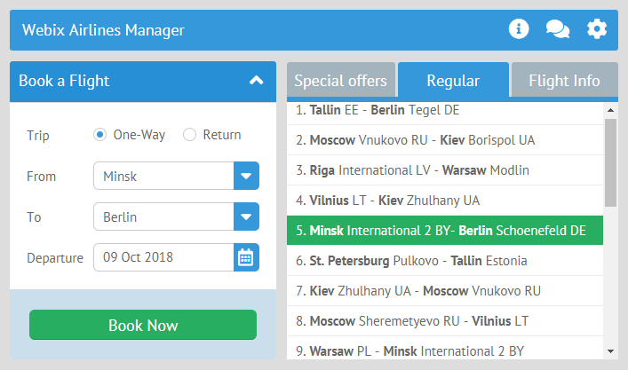
Compact
Section titled “Compact”To apply the Compact skin, include the compact.css file:
// Applying the 'Compact' skin to the app<script src="../codebase/webix.js"></script><link href="../codebase/skins/compact.css" rel="stylesheet" type="text/css">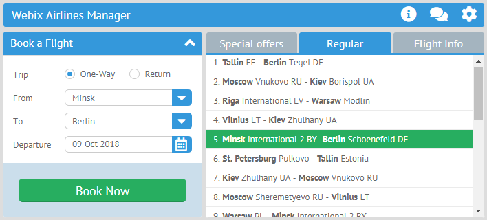
Contrast
Section titled “Contrast”To apply the Contrast skin, include the contrast.css file:
// Applying the 'Contrast' skin to the app<script src="../codebase/webix.js"></script><link href="../codebase/contrast.css" rel="stylesheet" type="text/css">
Willow
Section titled “Willow”To apply the Willow skin, include the willow.css file:
// Applying the 'Willow' skin to the app<script src="../codebase/webix.js"></script><link href="../codebase/willow.css" rel="stylesheet" type="text/css">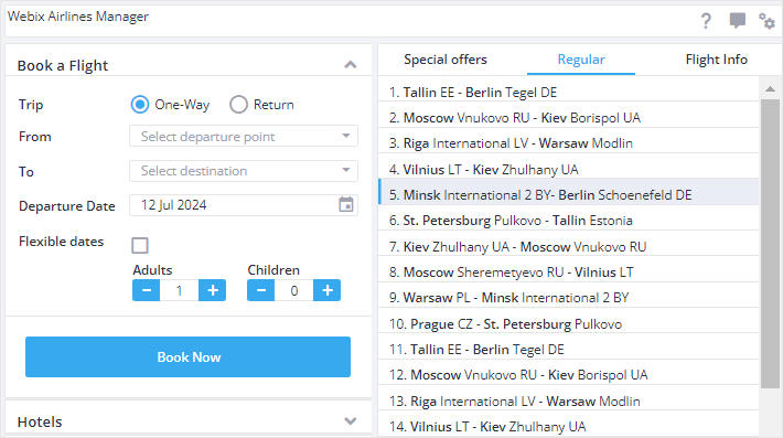
To apply the Dark skin, include the dark.css file:
// Applying the 'Dark' skin to the app<script src="../codebase/webix.js"></script><link href="../codebase/dark.css" rel="stylesheet" type="text/css">
Using Icons
Section titled “Using Icons”Default font icon packs
Section titled “Default font icon packs”Webix provides two predefined sets of icons depending on the used skin:
-
Webix Awesome Icons for Flat, Compact and Contrast skins - based on Font Awesome 5 collection
-
Webix Material Icons for Material, Mini, Willow, and Dark skins - based on Material Design Icons collection
Check the related sample to see the list of available default icons:
you can check the full snippet Icons Cheatsheet
The default Webix icons can be set in two ways:
- via the view config as icon:“wxi-name”
// using a default icon{ view:"icon", icon:"wxi-pencil" /*!*/}- via HTML as span class=“webix_icon wxi-name”
<span class='webix_icon wxi-pencil'></span>Custom font icon packs
Section titled “Custom font icon packs”It is possible to include any custom font icon pack for any skin. For this, you need to:
- include the desired font icon pack into HTML page;
- set the full name of the icon you want to use:
// using a Font Awesome icon{ view:"icon", icon:"fas fa-envelope"}// using a Material Design icon{ view:"icon", icon:"mdi mdi-email"}For example, you can use:
- Material Design Icons collection
- Font Awesome 5 collection
Skin Builder Tool
Section titled “Skin Builder Tool”The Webix library provides a handy tool Skin Builder that allows you to choose some of default skins for your interface and apply your designer skills to create a custom skin.
Customizing Skins
Section titled “Customizing Skins”There is a possibility to adjust the sizes of UI elements globally by changing skin JS settings.
The default settings for each skin are stored in the webix.skin.{skin_name} object and include a number of options, which you can freely redefine.
For instance, the default “flat” skin comes with the following options:
webix.skin.material = {  topLayout:"space",  //bar in accordion  barHeight:44,      //!!!Set the same in skin.less!!!  tabbarHeight: 42,    sidebarTitleHeight: 44,  rowHeight:36,  toolbarHeight:44,  listItemHeight:36,    //list, grouplist, dataview, etc.  inputHeight: 38,  buttonHeight: 38,  inputPadding: 3,  menuHeight: 36,  labelTopHeight: 22,  propertyItemHeight: 28,    unitHeaderHeight:36,
    timelineColor:"#1CA1C1",    timelineItemHeight:70,
  inputSpacing: 4,  borderWidth: 1,
  sliderHandleWidth: 14,  sliderPadding: 10,  sliderBorder: 1,  vSliderPadding:15,  vSliderHeight:100,  switchHeight:22,  switchWidth:50,
  //margin - distance between cells  layoutMargin:{      space:10, wide:10, clean:0, head:4,        line:-1, toolbar:4, form:8, accordion: 2    },  //padding - distance inside cell between cell border and cell content  layoutPadding:{      space:10, wide:0, clean:0, head:0,        line:0, toolbar:2, form:17, accordion: 0    },  //space between tabs in tabbar  tabMargin: 0,  tabOffset: 0,  tabBottomOffset: 0,  tabTopOffset:0,    tabbarWithBorder: true,
  customCheckbox: true,  customRadio: true,    sidebarMarkAll: true,  noPoint: true,  borderlessPopup: true,
  popupPadding: 0,
  calendar:{ timepickerHeight:24 },  calendarHeight: 70,  padding:0,  accordionType: "accordion",
  optionHeight: 32,  organogramLineColor: "#CCD7E6"};
You can also make changes in the currently used skin by accessing its settings via the $active keyword.
The example below shows how you can change the height of all inputs in your application:
webix.skin.$active.inputHeight = 50;
webix.ui({  rows:[    { view:"text", label:"Text"},    { view:"combo", label:"Combo" },    { view:"datepicker", label:"Date" },  ]});