
Headers and Footers
To enable headers and footers for a DataGrid, use the header and footer parameters:
webix.grid({ header:true, // by default footer:true, // other config})You can configure headers and footers with the attributes header and footer in the columns parameter.
A header can be:
A footer can be:
- Single-line;
- Multiline footer;
- single line or multiline with colspans (rowspans) and built-in counters;
Additionally, both header and footer can be rotated and can be of any height.
Single line header
Section titled “Single line header”To define a simple (single line) header, you should set it as a string.
A string can contain:
- text;
- images;
- html inputs;
- links.
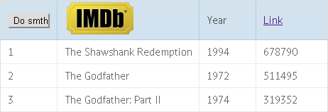
// Defining a single line headerwebix.grid({ columns:[ // header as a button { id:"col1", header:"<input type='button' value='Save' class='dummy_button'>" }, // header as an image { id:"col2", header:"<img src="/docs/media/../common/imdb.png">"}, // header as a text label { id:"col1", header:"Year"}, // header as a link { id:"col4", header:"<a href='http://google.com'>Link</a>"} ]})you can check the full snippet Different Types of Content in the Header
Multiline Header
Section titled “Multiline Header”To create a multiline header, define it as an array of strings.
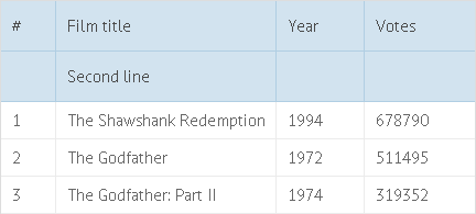
// Defining a multiline headercolumns:[ { id:"rank", header:["#"] }, { id:"title", header:["Film title", "Second line"] }, { id:"year", header:["Year"] }, { id:"votes", header:["Votes"] }]you can check the full snippet Multiline Header
Complex Header with Colspans (Rowspans) and Built-in Filters
Section titled “Complex Header with Colspans (Rowspans) and Built-in Filters”To make a header span across several columns or rows, define a header as an object or an array of objects. Header-objects can have the following properties:
- text - the text on the header;
- colspan - the number of columns a header should span;
- rowspan - the number of rows a header should span;
- content - functional header content (built-in filters , group definition, master checkboxes, etc);
- rotate - if true, rotates a header;
- height - changes the height of a header line;
- css - the name of a CSS class that will be applied to the column header.
Colspan
Section titled “Colspan”
To create a header cell that will span across 2 or more columns, set its colspan property:
// Using colspanscolumns:[ { id:"title", header:[ "Film title", { text:"Sub-header", colspan:3 } ] }, { id:"year", header:["Year", ""]}, { id:"votes", header:["Votes", ""]}]you can check the full snippet Colspans and Rowspans in the Header
Rowspan
Section titled “Rowspan”
To create a header cell that will span across 2 or more rows, set its rowspan property:
// Using rowspanswebix.grid({ columns:[ { id:"title", header:[ { text:"Film title", rowspan:2 } ] }, { id:"year", header:["Year", ""]}, { id:"votes", header:["Votes", ""]} ]})you can check the full snippet Colspans and Rowspans in the Header
Built-in filters
Section titled “Built-in filters”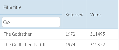
To put a filter into the header, set the name of the filter in the content property:
// Using filters in the headercolumns:[ { id:"title", header:[ "Film title", { content:"textFilter" } ] }, { id:"year", header:"Released"}, { id:"votes", header:"Votes"}]you can check the full snippet Filters in the Header
Read more about Filters.
Header Menu
Section titled “Header Menu”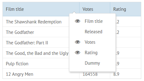
The built-in header menu allows the user to hide and show specific columns. This is how you can add a header menu:
webix.grid({ columns:[...], headermenu:true})you can check the full snippet Header Menu in the DataGrid
Read more about DataGrid Header Menu.
Hiding/Showing Headers and Footers
Section titled “Hiding/Showing Headers and Footers”If you want to hide headers, you can do this by creating the following function:
function toggleHeader(){ mygrid.config.header = !mygrid.config.header; mygrid.refreshColumns();};Second line of this function toggles the visibility of the header on and off. It does this by negating the current value of grid.config.header. If grid.config.header is currently true, it will become false, and if it’s currently false, it will become true. Then, using the refreshColumns() method, we refresh the structure of the datagrid to ensure that the appearance and layout reflect the new visibility state of the header.
To hide footers, change the grid.config.header property to grid.config.footer and don’t forget to repaint the datagrid afterwards.
you can check the full snippet DataGrid: Hiding/Showing Headers
Single Line Footer
Section titled “Single Line Footer”By default, footers are disabled. So, before configuring them for specific columns, don’t forget to enable them in datagrid settings:
// Enabling footers in DataGridwebix.grid({ ... footer:true})Footers are configured the same way as headers:
// Using footerswebix.grid({ columns:[ // footer as a button {id:"col1", footer:"<input type='button' value='Do something' class='dummy_button'>"}, // footer as an image {id:"col2", footer:"<img src="/docs/media/../common/imdb.png">"}, // footer as a text label {id:"col1", footer:"Year"}, // footer as a link {id:"col4", footer:"<a href='http://google.com'>Link</a>"} ]})you can check the full snippet Standard Header (Footer) Implementation
Multiline Footer
Section titled “Multiline Footer”To make a footer multiline, define it as an array:
// Defining a multiline footerwebix.grid({ columns:[ { id:"rank", footer:["Total", "Second line"]}, { id:"title", footer:[""]}, { id:"year", footer:[""]}, { id:"votes", footer:["12547"]} ]})Complex Footer Containing Colspans/Rowspans
Section titled “Complex Footer Containing Colspans/Rowspans”Complex footers must be defined as objects with the following parameters:
- text - the text on a footer;
- colspan - the number of columns a footer cell should span;
- rowspan - the number of rows a footer cell should span;
- content - the built-in functor of a column (summColumn);
- rotate - if true, rotates a footer;
- height - changes the height of a footer line;
- css - the name of a CSS class that will be applied to the column footer.
// Colspans in footercolumns:[ { id:"rank", footer:{ text:"Total", colspan:3 } }, { id:"title", ...}, { id:"year", ...}, { id:"votes", footer:"12547"}]Sum Counter in the Footer
Section titled “Sum Counter in the Footer”You can add a counter that will sum up all values in the column and display the result in the footer. The counter is called summColumn, and you should set the name to the content parameter:
// Using the sum counter in the footerwebix.grid({ columns:[ { id:"rank", header:"", footer:{ text:"Total:", colspan:3 } }, { id:"title", header:"Film title" }, { id:"year", header:"Released" }, { id:"votes", header:"Votes", footer:{ content:"summColumn" } } ]})you can check the full snippet Counter in the Footer
Rotated Header/Footer
Section titled “Rotated Header/Footer”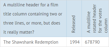
To rotate a header or a footer, specify it as an object (or array of objects if it’s a multiline header/footer). The height will be adjusted to text size.
columns:[ { id:"year", header:{ text:"Released", rotate:true }, footer:{ text:"Footer", rotate:true } }]you can check the full snippet Header Rotate
Custom Height for Header and Footer
Section titled “Custom Height for Header and Footer”To change the height, define a header/footer line as an object and use the height property:
columns:[ { id:"title", header:{ text:"Film title", height:25 }, footer:{ text:"80px footer", height:80 } }]you can check the full snippet Custom Height for Header Lines
Autoheight for Header and Footer
Section titled “Autoheight for Header and Footer”You can also enable autoheight for the header and the footer of DataGrid. The height will be adjusted to the content.
For this, you need to set a header or a footer as an object and set autoheight:true:
columns:[ { id:"title", header:{ text:"A multiline header for a film title column..", autoheight:true }, footer: { text:"A multiline footer for a film title column..", autoheight:true }, }]you can check the full snippet Auto Height for Header Lines
This setting also works for rotated header/footer lines:
columns:[ { id:"title"}, { id:"year", header:{ text:"Released", autoheight:true, rotate:true }}, { id:"votes", header:{ text:"Votes", rotate:true}}]you can check the full snippet Header Rotate:Autoheight
Custom Header and Footer Content
Section titled “Custom Header and Footer Content”All content elements for the datagrid header or footer are stored in a webix.ui.datafilter object. They all have the same configuration pattern.
They all have 2 methods:
- refresh() that provides logic,
- render() that draws an element.
Their parameters include:
- master - component object (here: datagrid);
- column - related column object;
- node - the HTML element.
You can either extend or redefine the functionality of any existing content element or create a new element.
Extending Existing Content Element
Section titled “Extending Existing Content Element”There is summColumn, the counter that can be added to a column footer. The counter will sum up all values in the column and display the result.
To create your own counter/aggregator, you can extend summColumn and redefine its refresh() method. For example, lets create avgColumn that will count the average value:
webix.ui.datafilter.avgColumn = webix.extend({    refresh:function(master, node, value){    var result = 0;    master.mapCells(null, value.columnId, null, 1, function(value){      value = value * 1;      if (!isNaN(value))        result += value;      return value;    });
    node.innerHTML = Math.round(result / master.count());  }}, webix.ui.datafilter.summColumn);
Creating Custom Content Element
Section titled “Creating Custom Content Element”Any content element must have the following methods (declare them even if you don’t need any specific performance from them):
- getValue() - gets the current value of an element;
- setValue() - sets the value of an element;
- render() - paints an element;
- refresh() - defines dynamic performance of an element.
You can also define other methods and properties and call events.
webix.ui.datafilter.customFilterName = { getValue:function(){}, //not used methods setValue: function(){}, refresh: function(master, node, column){ //event handlers node.onchange = function(){...}; node.onclick = function(){...} }, render:function(master, column){ var html = "..."; return html; }};A content element can have the following properties:
- trackCells (boolean) - indicates whether an element should be refreshed each time component data changes (if true, the refresh() method of a content element will be called automatically).
you can check the full snippet Custom Content for Header and Footer
Adding Custom Filter into the Header
Section titled “Adding Custom Filter into the Header”To embed a filter into the header of the datagrid, you need to implement the following steps:
1. Set a new filter into the datafilter object to integrate it with the header and add an input for it.
2. Set the getValue() method that will return the value of the input.
3. Use the refresh() method to provide the filtering logic in dynamics. Inside of the method, you need to register the added filter and attach a handler that will trigger the filterbyAll() method.
4. Apply the render() method to draw the newly created filter.
webix.ui.datafilter.customFilterName = { getInputNode:function(node){ return node ? node.firstChild : { value:"" }; }, setValue:function(node, value){ this.getInputNode(node).value = value.toString(); }, // returns filtering parameter getValue:function(node){ return this.getInputNode(node).value; }, refresh: function(master, node, columnObj){ // declare a built-in datagrid filter master.registerFilter(node, columnObj, this); // event which will trigger filtering node.querySelector("input").onkeyup = function(){ master.filterByAll() } }, render:function(master, column){ var html = "<input type='text' style='width:100%' id='cb1'>"; return html; }};5. Specify your filter as the value of the content property of the header attribute.
webix.grid({ columns:[ { id:"title", header:[ { content:"customFilterName" } ], fillspace:1 }, { id:"year", header:[ { content:"textFilter" } ], fillspace:1 } ], data:grid_data});In the above example we have added two filters into the datagrid header: a custom filter and a standard text filter. Data will be refiltered each time the value in any of the filters changes.